

In a previous post titled “No, The Base Earning for Hilton Honors Is Not Less Rewarding Than At Other Major Chains“, I’d presented the results of modeling that estimated the relative ‘values’ of hotel loyalty points currencies in terms of the size of the cash rebate that one gets for paying for a free hotel stay with points. Given that there are many hotel categories in each program’s award chart, real or implied (Hilton Honors), it would have been a self-defeating exercise to simultaneously do the modeling across all hotel programs and categories for all elite levels. Therefore, I opted to initially do the modeling only for very top elite status and highest award rate in each program, because (a) that is where the differentiation among programs is greatest, and (b) the equation for ‘spend per free night‘ (SPFN), which is literally the monetary cost of an award, is linear. That approach meant that once the basic modeling had been done at the very top and then explained, one could go back redo modeling up and down the award charts, and then plot the results for all the programs on the same chart for a direct visual comparison that takes into account the fact that the points currencies do not correspond 1:1 across loyalty programs. That is, in fact, why the standard average redemption values in cents/point that are peddled by travel bloggers cannot be directly compared across program!
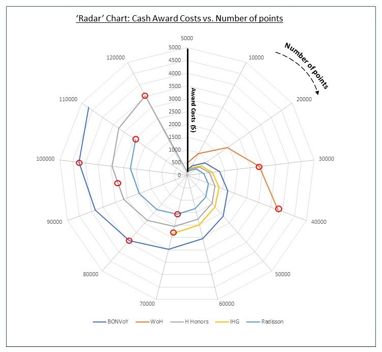
The first chart below is a ‘radar’ or ‘spiderweb’ chart that shows why modeling at the very top is more fruitful. The awards costs for different programs are widely separated at the very top, and then they bunch up as one goes down the award charts or award costs in points.
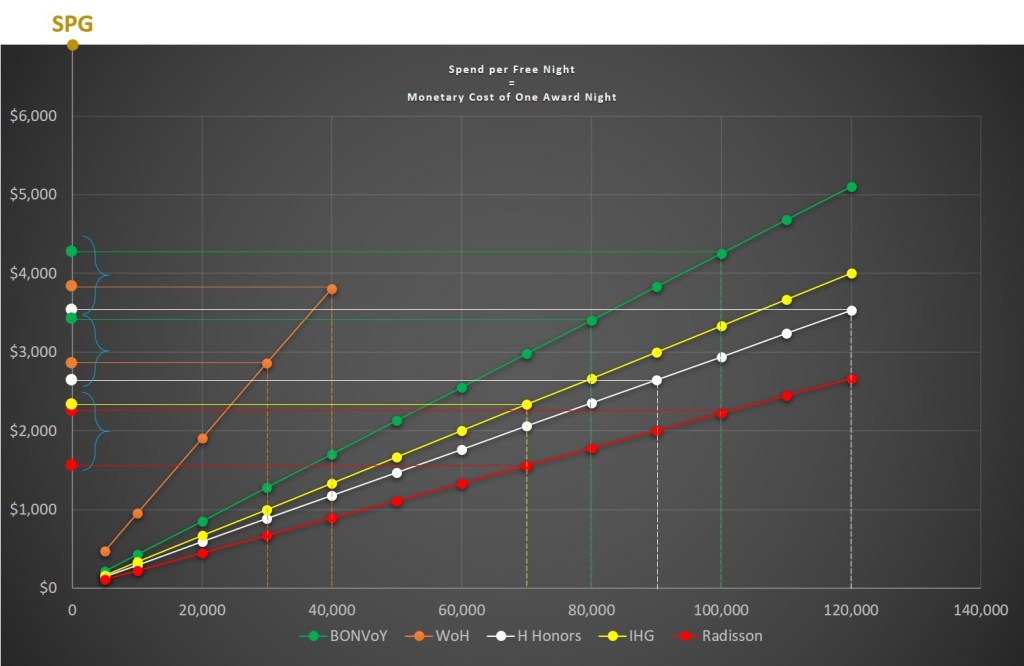
The second chart below shows linear plots of award costs in cash vs. award costs in points, up and down different hotel loyalty programs’ award charts. The chart also shows the greater differentiation among programs at the very top and less as one moves toward the lower end. As presented, one can pick any award cost along the x-axis and determine the corresponding monetary award cost for any program along the y-axis.
Bottom line: Though the initial modeling was done only at the very top, that does not mean that the modeling assumptions, which are few, were cherry-picked to reach a pre-ordained conclusion or outcome. The modeling and the math are simple, and the conclusion inescapable.
